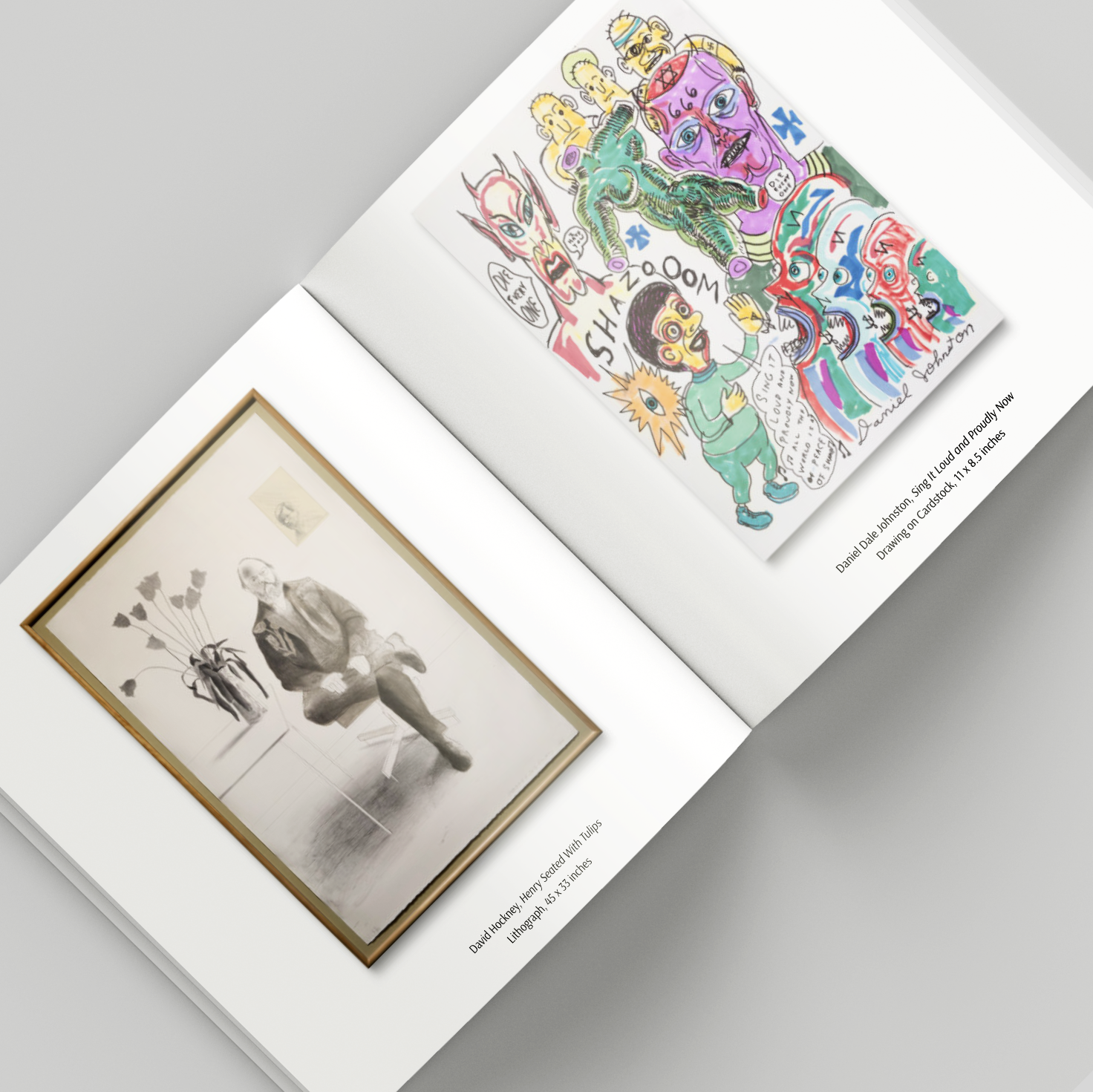
A client with whom I had previously collaborated on image editing projects reached out to me for design and printing assistance. He was working with an art collector who needed a small edition (5 books) printed catalog of 130 art pieces to bring to art fairs and for quick reference. My client had little experience with putting a book together for print. Outside of content, my client’s client was initially unsure what he wanted.
The Process
Consulting with my client, we decided to start with a 8″ square book on 80-pound paper. In this format, I created 3 sample layouts for the collector to review, one each for books of 280, 140 and 70 pages. I got quotes from 7 different print-on-demand companies for each of the 3 page counts and presented both the layouts and quotes.
Page from my quote package.
Once the collector selected a page count and printer, I commenced laying out the final book. The 140-page option permitted me to showcase one image per page with a caption beneath, and use the remaining pages for titles and index. After a couple of rounds of edits, the layout was complete. I created a print-ready pdf file and coached my photographer through the ordering process.
The Process
The final layout was completed on time, to everyone’s satisfaction.
Originally built by Dmytro Szylak (1920 – 2015), Hamtramck Disneyland has been maintained by Hatch Art since 2016.
The Problem
Components of this art environment are in perpetual need of restoration and replacement due to constant outdoor exposure. To maintain the visual density and cacophony that is expected of the environment from community members and visitors alike, new art pieces are constantly needed. This was as true in Szylak’s day as it is currently. Eight years on from his death, most of his smaller pieces had become too fragile to remain in place and have been removed by Hatch for safekeeping.
In conserving the site, Hatch walks the delicate line between honoring the creator’s legacy and remaining an active, relevant space to the present-day Hamtramck community. The site stewards look for new, original replacement pieces that are made in the spirit of Szylak’s work, but are not slavish re-creations.
The Process
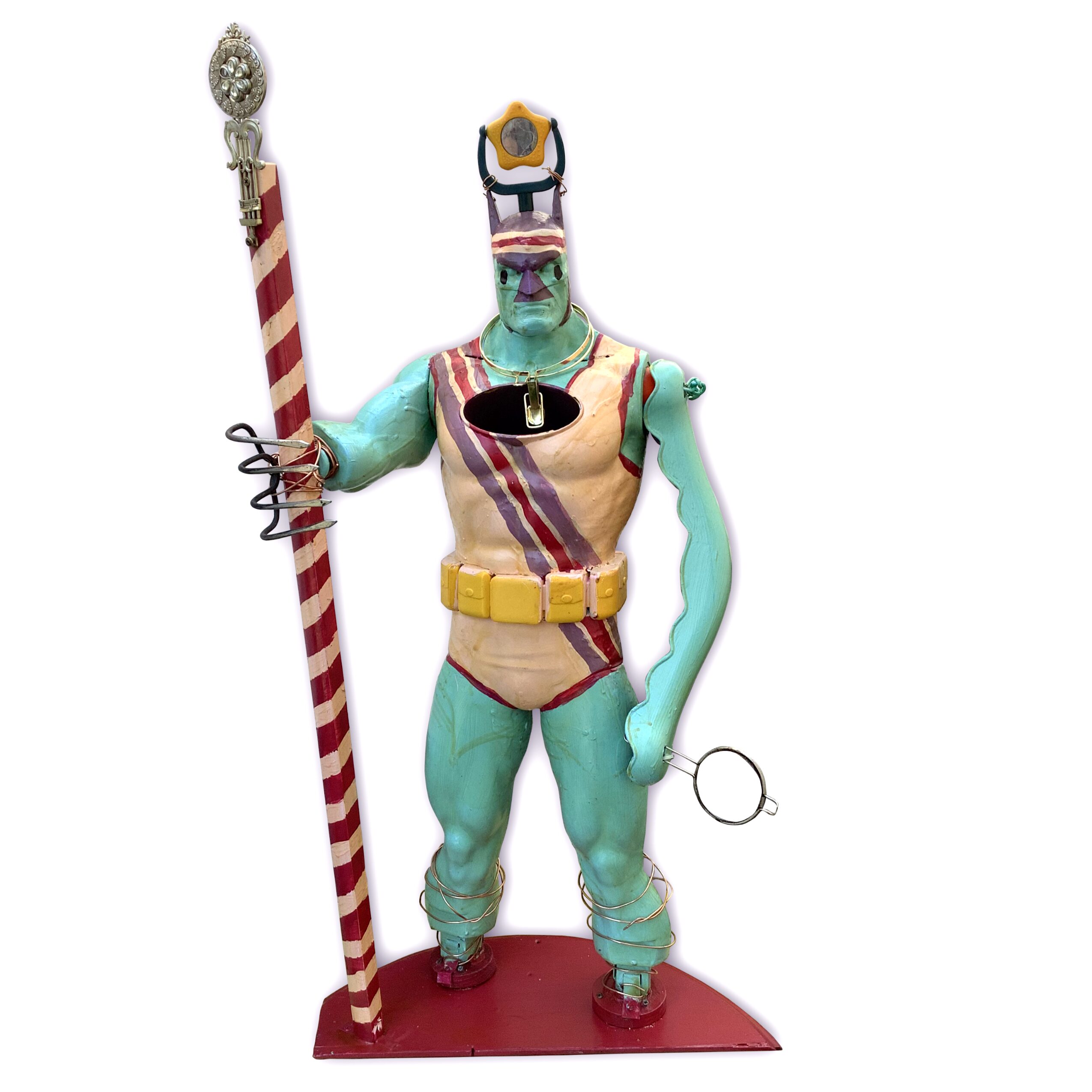
When adding to Hamtramck Disneyland, Szylak often incorporated junk he recovered from the streets and alleys around his home. The moment I saw a discarded Batman toy a few blocks away from the site, I knew it should have a new home there.
I grabbed this picture from an eBay listing; apparently the figure I found once looked like this, and originally stood 4 feet tall. Mine was a lot more beat up. He was missing a left arm, right forearm, both legs below the knee, and a cape. There was also a gaping hole in the chest where a light-up bat signal used to be.
For balance, I gave him a staff to hold and attached it to the the shortened arm with copper wire. Both the stick and legs were mounted to a salvaged tabletop which served as a base.
I hadn’t found a good replacement left arm at the time of this sketch.The paint job underwent a few revisions.
I had recently broken my cultivator rake while working in the garden, so that happy accident resulted in his right hand. The opposite arm was made from another trash day find.I had recently broken my cultivator rake while working in the garden, so that happy accident resulted in his right hand. The opposite arm was made from another trash day find. Other found toys and stuff I had around the house were re-puropsed as accessories.
Using paints available at the Hamtramck Disneyland site, I repainted with the figure to help transform him into a new character. The skintight nature of Batman’s costume limited the clothing options, but a fun leotard and matching sweatband seemed appropriate.
Results
The Sentinel, as I call him, was added to the newly-rebuilt central structure in the fall of 2023. It one of the few pieces mounted before conservation efforts stopped for the season. He held his own all winter, adding visual interest to the structure. He’s now one of many of visual delights to discover onsite, and can be spotted in visitors’ photos, including one from a recent New York Times Style Magazine article.
These instructional sheets are mailed to citizens summoned for jury duty in five regional divisions of the U.S. District Court. I was tasked with a complete redesign of both the summons notice and accompanying information.
The Problem
I consulted with court employees. The mailing they had been sending at the time confused many of the people who received it. Some were not aware that they were legally required to fill out a questionnaire, or that there was a deadline. Others had trouble finding the questionnaire online. Recipients were calling the court with questions that should have been answered by the sheet. In many cases, the answers were already contained in the sheet, but the information was disorganized and difficult to find.
The original sheet was a black and white Word document formatted into paragraphs. The court hoped that by setting a more intentional hierarchy of the information contained in the sheets, they could spend less time responding to juror questions and reduce the number of “second notice” mailings.
Summons (Front)Summons (Back)
The Process
My first task was to read through the original documents and group related information. I scribbled notes on a printout and wrote out notes longhand. I moved immediate required actions to the first page in a section clearly labeled Instructions. To accommodate the paper and envelopes used by the court, variable data such as the recipient’s address and 9-digit participant number needed to remain at the top of the page, so I used a color block to draw the reader’s attention to the instructions at the bottom. The back was reserved for information that wouldn’t be relevant until the the summoned individual had instructions to appear in court.
I was able to further organize the information for both documents through the use of color, varying font weights, lists, images, a table, and maps to each of the five courthouses which I custom-created to match the colors and typefaces of the whole mailing.
While I designed the sheets in InDesign, I created an editable version in Microsoft Word, enabling courthouse employees to make edits in the future as needed.
Info Sheet (front)Info Sheet (back)
Results
This was a meaningful project for me: I enjoyed using my design skills in the service of making a civic duty a little less confusing and intimidating for people. Nearly a decade later, these instructional sheets are still in use by the court.
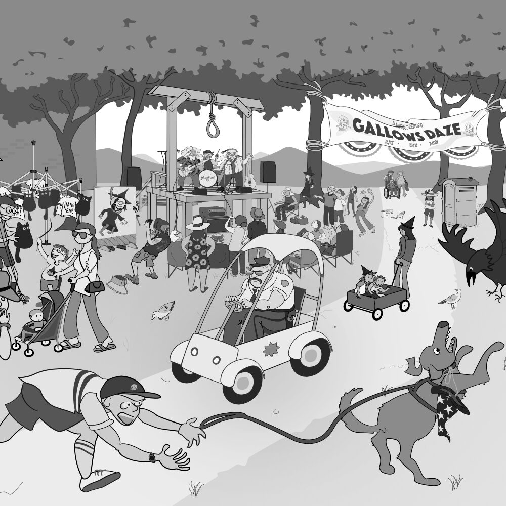
This is a page from a larger work in progress, A is for Ambroseburg; an alphabet book by writer Michael Wells and myself.
The Problem
Mike’s script is deliberately vague, letting my illustrations to tell the deeper story. We discussed potential directions I could take the visual accompaniment, but final decisions were left in my hands.
In terms of storytelling, the main challenge was fleshing out when and why the citizens of Ambroseburg “decided to get rid of their witches” and speculate upon what present-day significance the gallows may hold in the town.
To keep consistent with the rest of the book, all image and text elements needed to appear on the page without ruled borders separating them. Therefore, the main design challenge was to incorporate the words and the two depictions of past and present together as an organic whole.
Brainstorming notes. The idea for a present-day “Gallows Daze” came to me pretty quickly. Settling on a historical era and the circumstances behind the inciting incident took a few tries to get right. The plush black cat arrived fully formed.
The Process
I start each page with doodles and notes. It had been established that the town was founded in the latter half of the nineteenth century, meaning the gallows would have been erected after that time. I ultimately decided to set the story in the context of the 1980s Satanic Panic. This excited me because the event would be in living memory of many of the townspeople, making the bland annual festival it inspired all the more absurd.
Revealing the history via a pile of newspaper clippings proved to be a good solution not only in terms of visual composition (the ragged edges of the torn paper formed a soft frame), but also as a means to further dig into the backstory from a number of perspectives. I was even able to incorporate characters who appear elsewhere in the book.
The bottom scene had a lot going on, and to figure out how to fit it all in I found it helpful to build a little model of it from stuff around the studio . I referred to this to make a pencil sketch, which was the basis for the final digital drawing.
Results
The book is still in progress, so its ultimate success remains to be seen, but this page was well received by both my co-author and on social media, where I picked up some new readers as I posted progress updates.
Pencil sketchDigital construction of the background Populating the scene